8.5.2 Team Branding Examples
This section will show you some examples of team branding. We picked teams that we know, or we think are good examples of branding. If you know of a team that has good branding, please let us know and we will add them to this list.
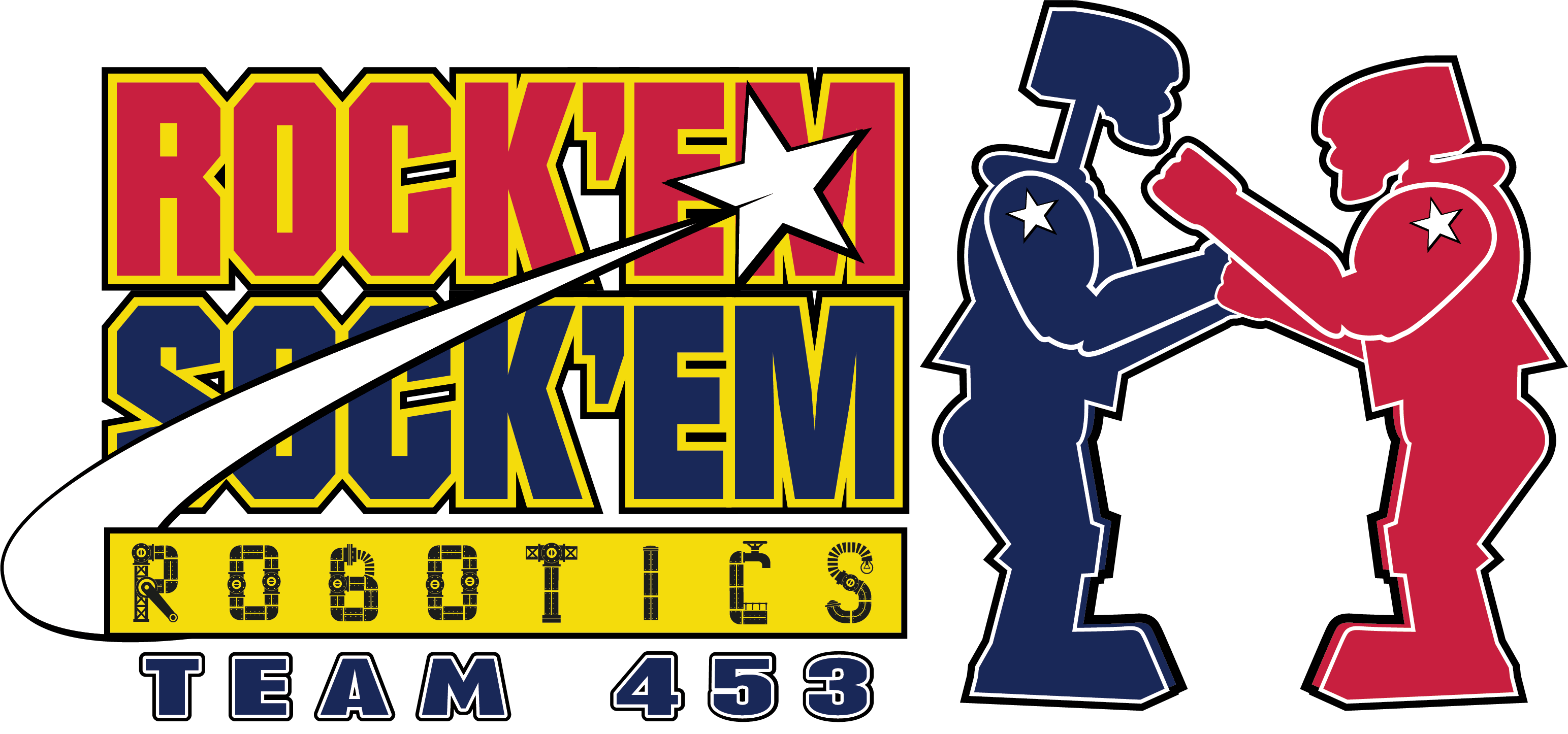
Team 453 - Rockem Sockem Robotics (Author’s team)
The Team Website was just redone with some of these ideas in mind. The previous website was a bit dated, and the new one is much more modern and easier to update using SSG just like FRCzero.org does. The team is also using Canva and Paint.net to do 99.9% of all graphical design work this year. In the past we’ve had a mixture of tools, designers and as you’ll see later on, some of the designs were not consistent. This year we are trying to be more consistent and use the same tools and processes to create all of our graphics.
Current Branding Examples

Previous Branded Items
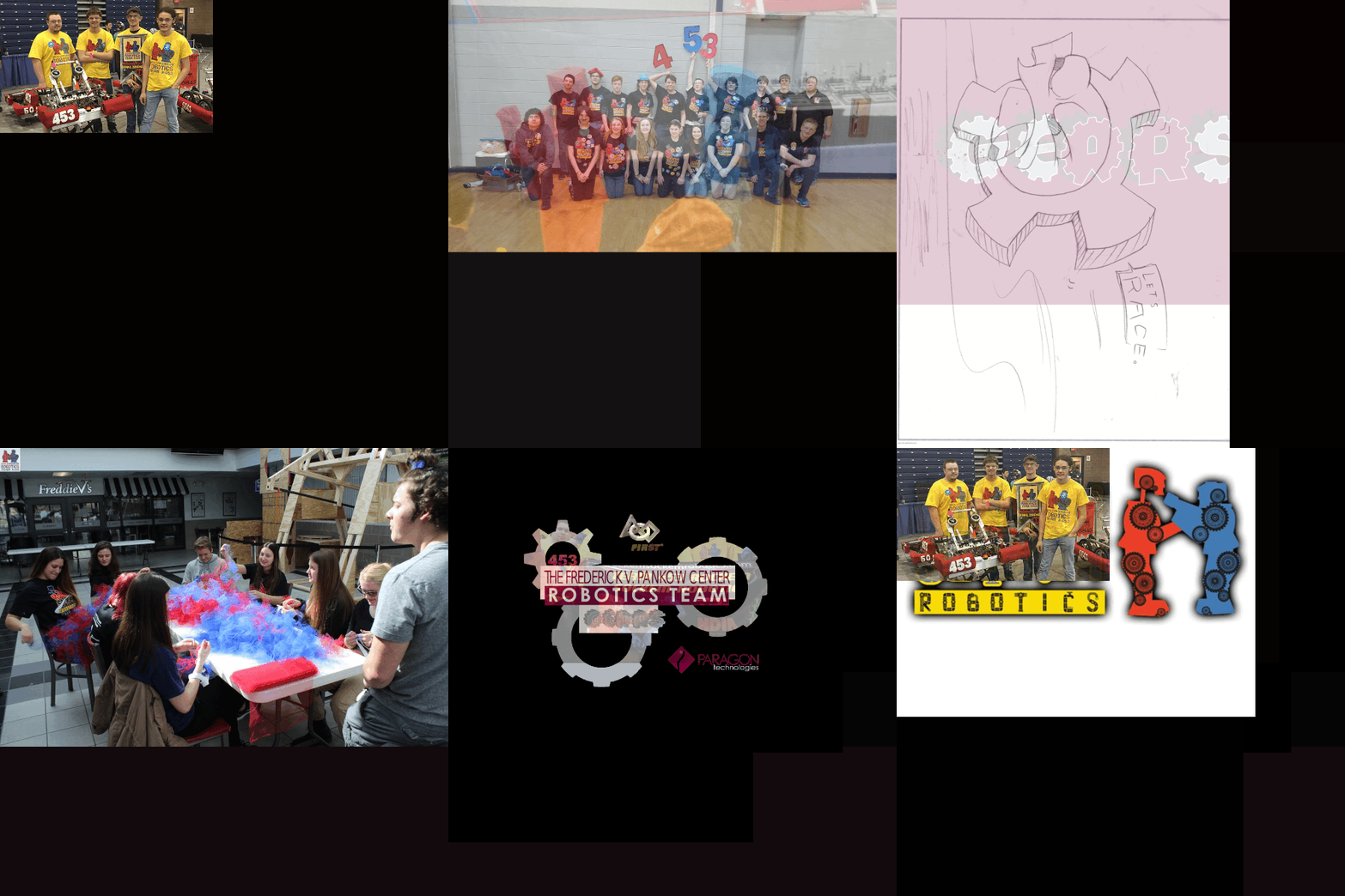
Even throughout the past (after we became RSR) we have always stuck to several core items. The Rockem Sockem Robots (This is kind of stealing from Hasbro?) but we’ve had this same branding usage for 10+ years. We are specifically “Robotics” and not Robots for this reason. We don’t use official artwork, but everything is heavily inspired. Our mascot costumes were officially licensed “Blue Bomber” and “Red Rocker” halloween costumes. They are around, but will be getting a makeover soon due to age and wear.
Students on the team worked with our Graphic Arts teacher. He teaches at the school during the day and mentors the team, walk ins, former students and anyone willing to seriously learn. He helped us even back during our time as G.E.A.R.S. He gave the students alot of creative freedom and we didn’t have a “standard” like we do now. But this gave us a rich history of material to draw from now and in the future. ALWAYS KEEP PHOTOS OF YOUR WORK! Looking back at it now 10-20 years on is amazing!
Team 254 - The Cheesy Poofs (You knew it was coming, don’t lie)
Their team website is here. The team has a very strong brand and is one of the most recognizable teams in FRC. They even have a published branding standards document that you can view here. They are a great benchmark and we based alot of this information on their branding standards document along with FIRST’s branding standards document and our own choices.


Their youtube channel is here.
Team 33 - The Killer Bees
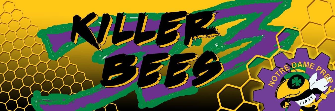
Their team website is here. They take branding to a different level when it comes to competition. If you ever see people with Yellow Antennae headbands, they’ve been visited by the bees. They have done a redesign of their branding recently and it looks great.

Their youtube channel is here.
Team 1868 - Space Cookies
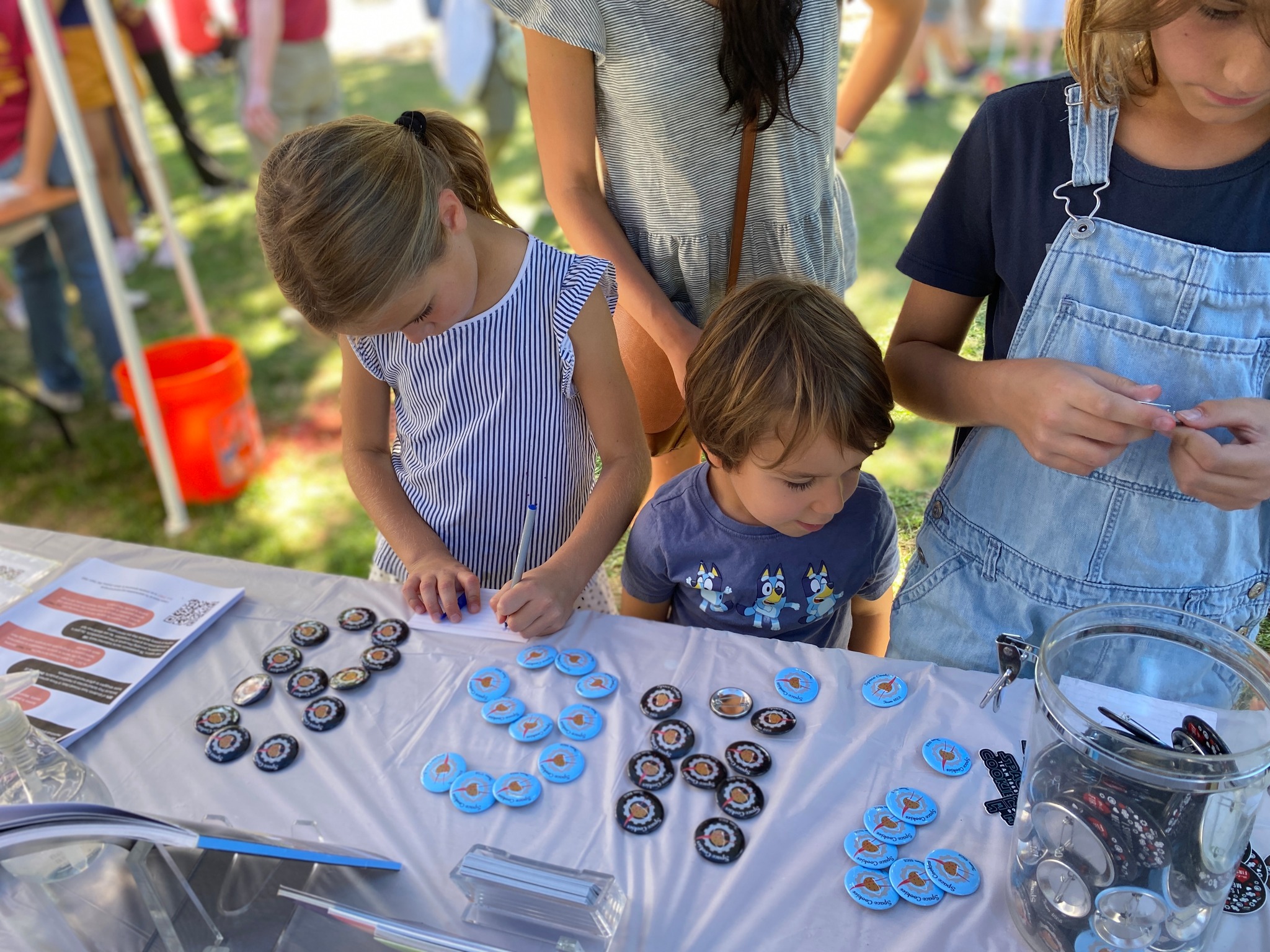
Their team website is here. They are an all girls team that is sponsored by NASA! They have a great professional website and are a great example of branding. They also publish a branding standards document that you can view here. They also have a branding summary here.

Their youtube channel is here.
If you want to add more examples, you can do so by editing this page on github and submitting a pull request or submitting an issue. We grabbed just a few to start with, but there are many more teams that have great branding. The files are large, so we didn’t want to include them all. If you want to add more, please do so and we will add them to the list.